Buddy Experience

Over all I had a great experience with my buddy this year, she was always on time and easy to contact. All the tasks I gave her she carried out with great care and precision. Having been a buddy last year I learned a few skills that were necessary for a professional show build so as a third year this year I tried to show her what was expected and why. I also shared my experiences and insight on what things have helped me in this process so that she will be better prepared when its her turn. This process has also taught me what it would be like to work as part of a team on the same project and how to communicate successfully to ensure things were done efficiently and correctly. It was very helpful for me and kept my stress levels down which was great.

IMG_20190430_155434.jpg
cof

Exhibition Build

Putting the exhibition space up was a lot harder and more time consuming than I thought, because there were lots of unforeseen details that had to be refined and adjusted according to my physical space. there was a white pipe sticking out of the floor that was a part of the buildings fixed features, so I had to organise to get a plinth made to cover it. This plinth ended up being an integral part of the space which I used to display my throw pillows. The painting was relatively quick and easy especially with the help from my second year buddy who has been amazing. the difficult part of the painting process was finding the correct paint. i went to all the local suppliers with some of my samples and eventually chose a Valspar green called Dragon Song.

IMG_20190429_155414.jpg
Choosing Paint Colours

The layout and placement of individual elements however was a bit tricky as there were so many possible options. On the second to last day I found the best layout and only then did I begin to fix things into place. Here are a few of the possible layout combinations I could have used.

The other big issue I had was ordering and receiving fabric deliveries from fashion formula on time. This was more my misjudgment than it was their error. They were easy to contact and I was able to update my delivery to arrive on time. This slowed my progress but I was able to get everything done still with time for adjustments.

LRM_EXPORT_229817127094563_20190513_180019904

Final report and reflection

My interiors collection, titled Pamushana which translates from the Shona Language to ‘a place in the sun’, is inspired by the exotic nature of fauna and flora found in my home country Zimbabwe. It is bright and playful perfect for someone who wants to add an eccentric touch to their home. The current maximalist trend resonated with the memories of growing up in a house hold full of eccentric prints reflecting the mood and colours of summers in Africa. The colour palate I have chosen is synonymous with the bright greens of the grass and crops on our farm, the deep blues and purples of a storm laden skies and the bright saturated reds and oranges of my grandmother’s English styled garden.

I have looked both closer to home and further afield for inspiring artist and designers. Throughout my life my mother, a textile designer and fine artist, has been a big influence and inspiration to me. She specialised in starch resist African prints using vibrant colourways and stylised motifs of birds, fish, fruit and animals. Although we have a very different style we have the same understanding of colour. I have tried to best portray my use of colour throughout my collection, using contrasting bright colours much like my mother’s designs. Ardmore is another major inspiring African textile and pottery company based in South Africa owned by Fee Halstead. Her designs have been key in inspiring my choices of motifs and pattern placements. They too are also very playful, bright and distinctly African. On reflection, my designs are not necessarily typically African in appearance but are my interpretation of the ‘Zimbabwe Garden’ that I grew up in. My own little place in sun.

After the research phase I began the drawing and design development stage of the project. I do struggle a bit when beginning this stage as I am having to decide which media works best for me and the project at hand. Only once I have done a few design samples and experiments do I find which style of drawing is best for the final design outcome. For this project I wanted the designs to have a graphic appearance finished in illustrator, so I found that doing solid black drawings using fine liner and markers were the best option. I did however experiment with other media such as watercolours and acrylics. The acrylics were also somewhat successful because when painting I was able to achieve solid colours that could be easily interpreted by the illustrator software.

Having to create so many coordinating designs has been quite challenging for me, but after some research into companies textile collections I have been able to dissect what makes up a good collection and have tried to implement it in my own collection. Casamance a French company has been one such textile design firm that I thought had particularly amazing and diverse collections incorporating large florals with smaller geometric Ikat prints as well as all over texture prints and 3D embroidery elements. In the first stages of my design development, I had initially intended to incorporate embroidery embellishments to accentuate the maximalist theme, but after I had sampled a few pieces, I decide not to incorporate it as on some designs it looked too arbitrary and there were too few that suited the embellishment. Through the process of experimentation I did learn a few new techniques such as cord making, fringing and Turkish carpet stitching, I would definitely use these methods in any future projects I have as I found them to be eye-catching and successful, just not in the case of this particular project.

The second important part of this module has been professional practice and developing a brand for myself. To assist in this I created a brand board with guide lines that I can follow to ensure consistency across all platforms. This element has been extremely useful in creating press packs, Instagram accounts and websites. The responsive website I have created as my online portfolio has been coded in HTML and CSS, which I have learnt on additional courses outside of my degree. An important thing for me is having as many skills as possible so that I can find and develop the ones I love the most whilst still knowing how to do everything. Professionalism is one of my strengths so where ever possible I bring it out in my work.

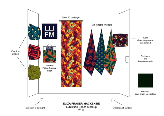
The next major part of the module was our exhibition display, and I had two general ideas in mind. I either wanted to do a mock interior space with an upholstered piece of furniture, lampshade and cushion and a rail with my samples. I ended up not choosing this idea and went for my second plan which was creating more of an exhibition style display with large lengths of fabric being the main focus of my show. I have incorporated some products in the form of throw pillows, because that is the main thing my designs are intended for. And instead of the rail I had my fabric book.

I felt that with the rail option, it would dictate my space design more than the fabric book. With the book, less display space would be taken up so I would have room to play with more striking larger fabric pieces. I had either the option of making it myself or getting it made by Abby bookbinding. Ultimately it came down to cost. It was cheaper for me to make it on my own, and I trusted myself to do a good job. It was a lot harder than I expected and admittedly I did make a few errors here and there, but overall I am happy with the outcome as it was my first attempt.

Putting the exhibition space up was a lot harder and more time consuming than I thought, because there were lots of unforeseen details that had to be refined and adjusted according to my physical space. The painting was relatively quick and easy especially with the help from my second year buddy who has been amazing. The layout and placement of individual elements however was a bit tricky as there were so many possible options. On the second to last day I found the best layout and only then did I begin to fix things into place. The other big issue I had was ordering and receiving fabric deliveries from fashion formula on time. This was more my misjudgement than it was their error. They were easy to contact and I was able to update my delivery to arrive on time. This slowed my progress but I was able to get everything done still with time for adjustments.

Professional Practice: Press Packs

The press packs that we are required to submit for the degree show have to contain CV, business card, artist statement, postcard, portfolio, swatches of fabric, and links to any online content. I have decide to create more than required so that I am able to hand them out to possible future employees and any other interesting contacts at the exhibition or other networking events. I intend to design a folio/envelope printed on both sides with a pocket for my samples, postcard and CV. I have used a specific design on my postcard and matching business card, so I want the other contents to follow a similar style as well as match my website and other promotion material.

Because of my interest In graphic design I would like to use this as part of my portfolio included on my website as I will have a section for digital design as well as textile design.

Creating my Fabric Book

When I was deciding how to display my designs, I thought about either a rail or an interiors fabric book. I felt that with the rail option, it would dictate my space design more than the fabric book. With the book, less display space would be taken up so I would have room to play with more striking larger fabric pieces. I had either the option of making it myself or getting it made by Abby bookbinding. Ultimately it came down to cost. It was cheaper for me to make it on my own, and I trusted myself to do a good job. It was a lot harder than I expected and admittedly I did make a few errors here and there, but overall I am happy with the outcome as it was my first attempt. I have a better understanding of the materials that I was working with and the tools needed to ensure that my next sample book is as near to perfect as possible. I have included some of the process photos below.

Exhibition Display Plan

For my final exhibition display, I had two general ideas in mind. I either wanted to do a mock interior space with an upholstered piece of furniture, lampshade and cushion and a rail with my samples. I ended up not choosing this idea and went for my second plan which was creating more of an exhibition style display with large lengths of fabric being the main focus of my show. I have incorporated some products in the form of throw pillows, because that is the main purpose of my designs . And instead of the rail I had my fabric book. as part of the requirements we had to submit a professional space plan to be able to properly prepare for the build. Below is my first and then updated space plan. Once our initial plans were assessed we were given our spaces, and not all our wishes were granted which meant a second updated plan had to be made.

space mockup-01.jpgspace fini-01

Design Development

I have been a bit slow to start creating my pattern designs for this module because I have been focusing a lot on drawing and painting my motifs. Once I had quite a few motifs ready, I began creating my designs alongside my drawing. The only problem I have had with this is that I wasn’t creating any hero designs, only secondary’s. So once I realised this I began to finish drawing my motifs in order to have enough to create a hero design. Once I have my heroes, I will then design the secondary’s and blenders based off of them. Once I have the majority of the collection I will address the exact scale and colours that will work best for my designs. Some of the patterns I have been working on are included below. With these designs I have scanned the paintings/drawings and imported them into illustrator to create a vectorised image which I have then put into repeating patterns. The patterns below are mostly densely scattered repeats but I do intend to vary the placements of the motifs within the other designs I create.

Reflection on Interim Presentation

The interim presentation with the tutors was really beneficial because I was able to see what stage I was at and where I needed to improve. I found I was slightly off track on my pattern development and had not created any hero designs and only secondary or blender patterns. I felt like this was because I had not yet built a full bank of motifs to start creating my patterns with. Something I have found about myself is that I tend to develop my patterns as I draw or paint my motifs. I have not identified this as a problem but possibly I could work faster to ensure I remain on track. Some of the feedback that I received from the tutors was to paint at a larger scale, and so straight after the presentation I set out to complete 10 large scale paintings that I could use for one of my hero designs.

Professional Practice: Self Promotion

Steve Aichler from the entrepreneurial team at Cardiff met came into the studio today to give us a lecture on how to best promote ourselves online using different social media platforms. Earlier on in the year we talked about branding ourselves so this was a good follow on lecture from that as they both go hand in hand.

The important thing about having an online presence as designer or business is having a consistent appearance across all platforms. This is where having clear brand identity and guidelines is beneficial. Once you have the brand, all you need is a platform and content to promote it. Some of the best platforms used by designers and professionals are Instagram, Linked In, a website and blogs. There are others like Facebook and Twitter, but you need to use the correct ones that will be most relevant for your content and ones that will engage more with your targeted audience. All the platforms can be used in conjunction with each other, using links, offering slightly different content. For example your website and Linked In may be very formal whilst Instagram can be more relaxed and personal.

As part of my response to this lecture I want to create my own brand identity and implement it on my website and Instagram. I also want to update my Linked In. I will write another post that will document my progress as I go along.

Theme and Colour Update

As I have been progressing with my project I have noticed that it is slightly changing from my original theme. I am no longer focusing on the African java prints as my main source of inspiration. This is because I felt like the patterns and motifs I was creating weren’t fitting with that design style.

I have also come up with a title for my collection, I have called it Pamushana which translates from the Shona language to ‘a place in the sun’ I felt like this was a good name to give my collection because my home country Zimbabwe, which is always sunny and warm, is the main inspiration behind my collection.

Another thing that I have slightly changed in the process is my colours, this is because I noticed that the colours on my screen were not the same as how they were printing out onto paper or fabric. I have since ordered some fabric samples, a colour atlas and my own swatches from fashion formula and I have managed to fix all the colour issues apart from one colour, maroon, it is still printing out a bit too brown.

colour update